


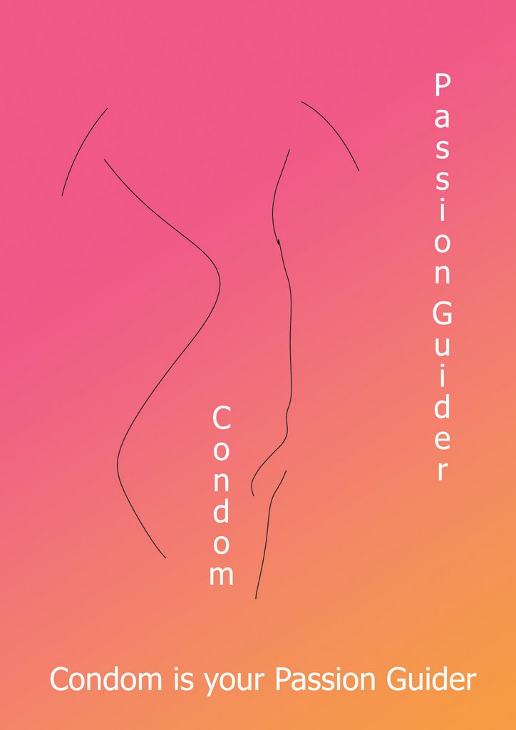

This is my first poster. I used lines to draw the woman and man body. They are all abstracts.I want to give to the viewer the benefit of condoms. If the condoms are the passion killer, why don't you let it be your passion guider. With this design I also change some different color to see how different effect on it. for example, with blue and violet the poster does not work well with its statements. Furthermore, with the light pink and orange I think the poster can bring the passion colour and flavour for the viewer. With the third poster, I change a part of it to black to make it look more impressive and attractive, I also play around with the text color. The final poster I changed my statement, I choose the black background to emphasize the important of condoms.
Could you give me some critics and advices?
I am not confident much about the text and the place where I put them.
I think my posters are not good much.
posted by Cok The Loc Choc at 11:18 PM
![]()

1 Comments:
I do like some of your experiments here very, very much. Typographically, if you are going to set type on the vertical, it works much better if you capitalize - because capital letters are stable and usually balanced on both sides, where as a lot of lowercase letters are actually visually unbalanced.
Post a Comment
<< Home